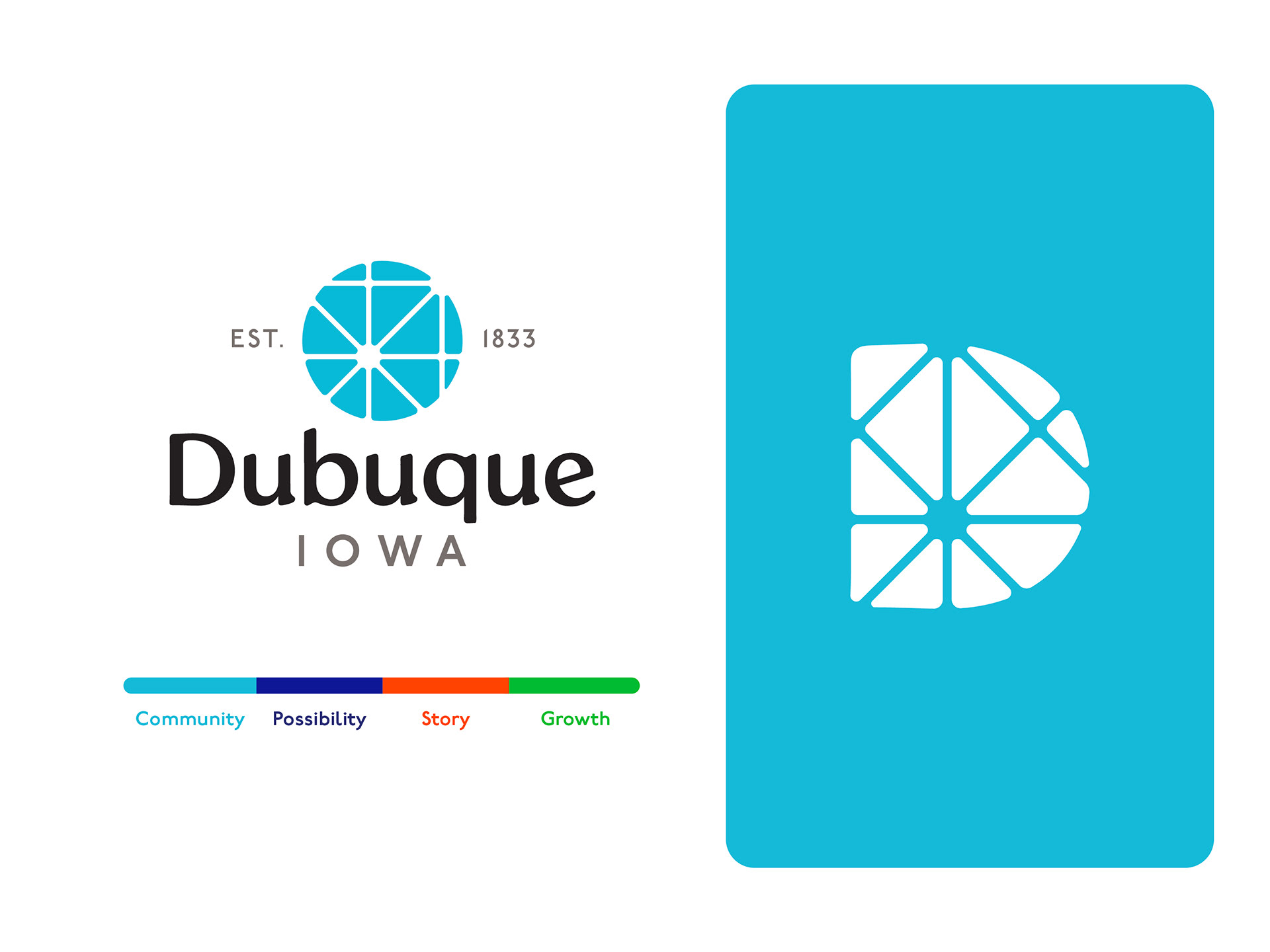
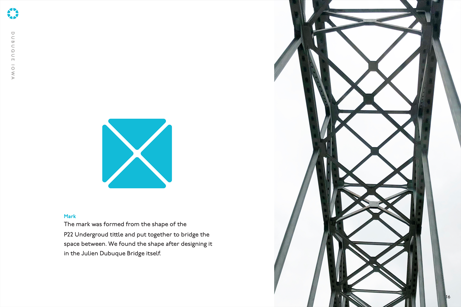
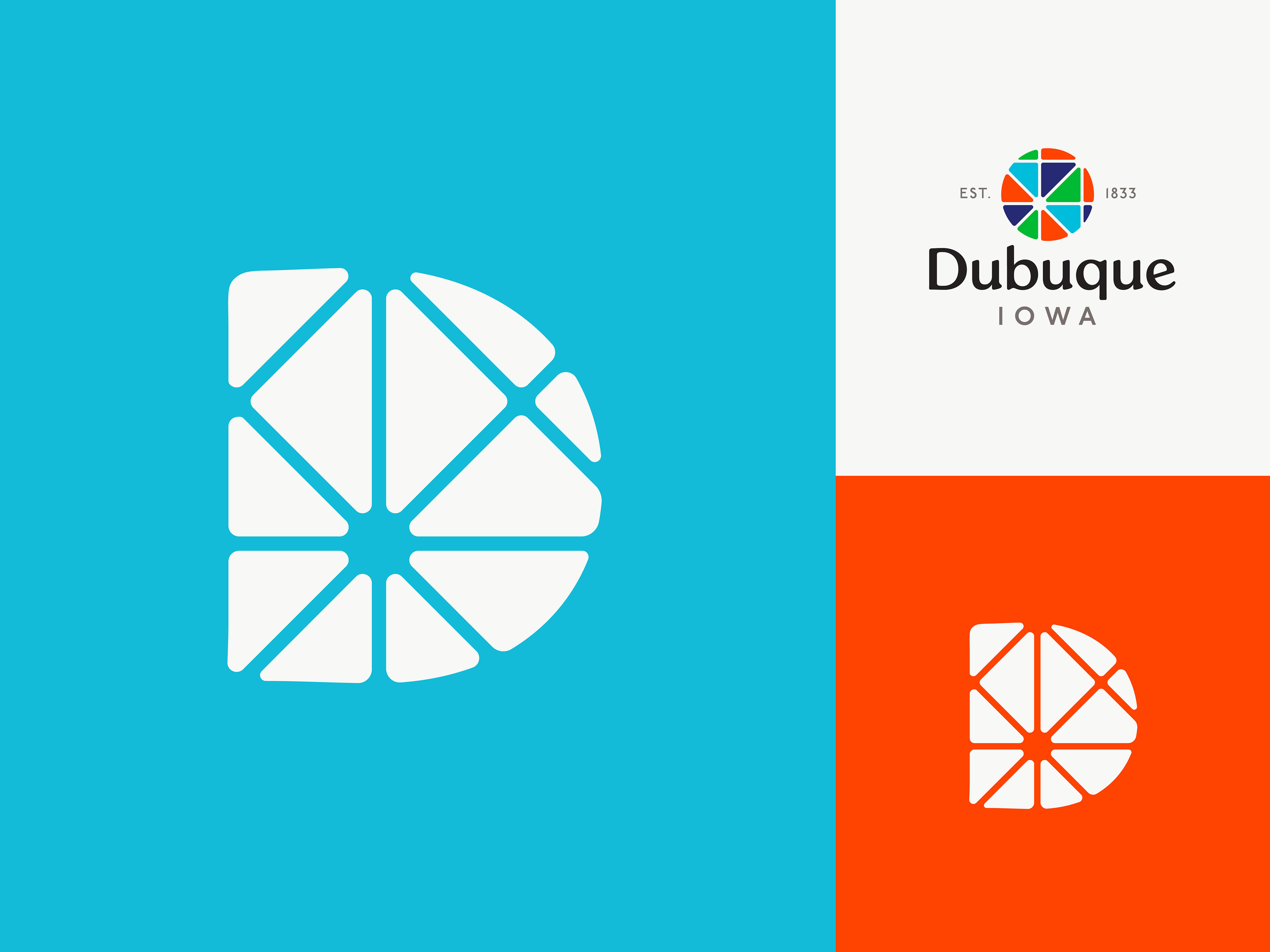
This comprehensive brand identity accurately encompassed the City of Dubuque Iowa’s history, values, and personality. The central mark is formed from the P22 Underground tittle, a font that has a long history of connecting people to place, and can be found in the design of the Julien Dubuque Bridge itself. My team built on current opportunities to craft a community-focused visual identity system that all people groups of Dubuque can rally behind in unity. Our aim was to create a single voice that is uniquely Dubuque, that emphasizes the revitalization of the community. In the design process, my team was led by a value for connection, especially bridging the space between disparate entities. The city's goals are visualized through colors to tell the story of community, possibility, and growth. When put together, the color and mark forms a pattern embodying abundance and diversity. In collaboration with Keaton Schenck and Sarah Gilliland.
